01 PROJECT OVERVIEW
A great number of websites have bad UI and UX design. Users feel confused about how to use them and struggle to understand the website. I found out a website named"greatdreams"(http://www.greatdreams.com). Based on the principle of evaluation, I analysis one website. Using the analyze, I redesign the website.
02 EVALUATION
Heuristics Evaluation:
Widgets and labels near targets: There is no label near targets to indicate the meaning and function of targets.
Group like widgets/functions: No any groups to separate the function and content in pages. For example, for the recommendation, there is no text and images group together. The text and images are placed in the same way.
No instructions: When users meet problems in using website, they need help and instruction to learn how to use the web. Website clarifies the way to using the website and the certain steps for achieving a thing in a website. No instruction means there is no way to find any help. It decreases the passion of users.
UI Evaluation
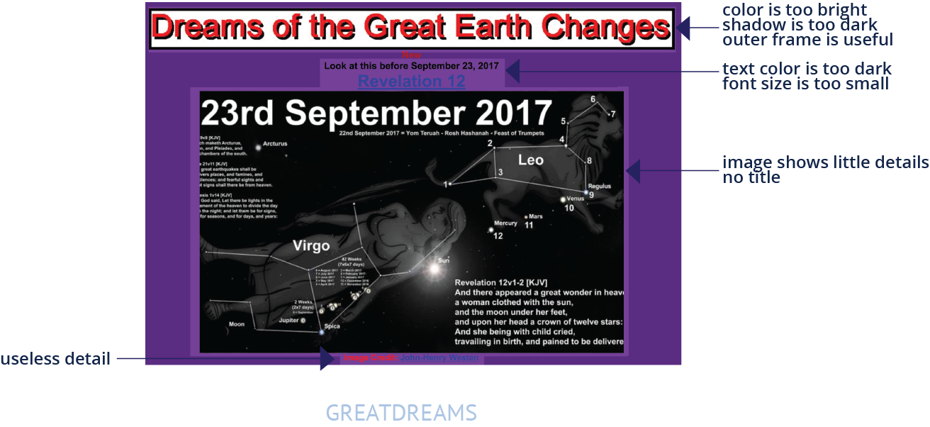
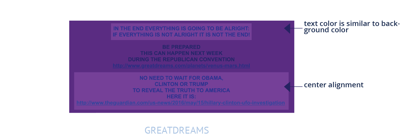
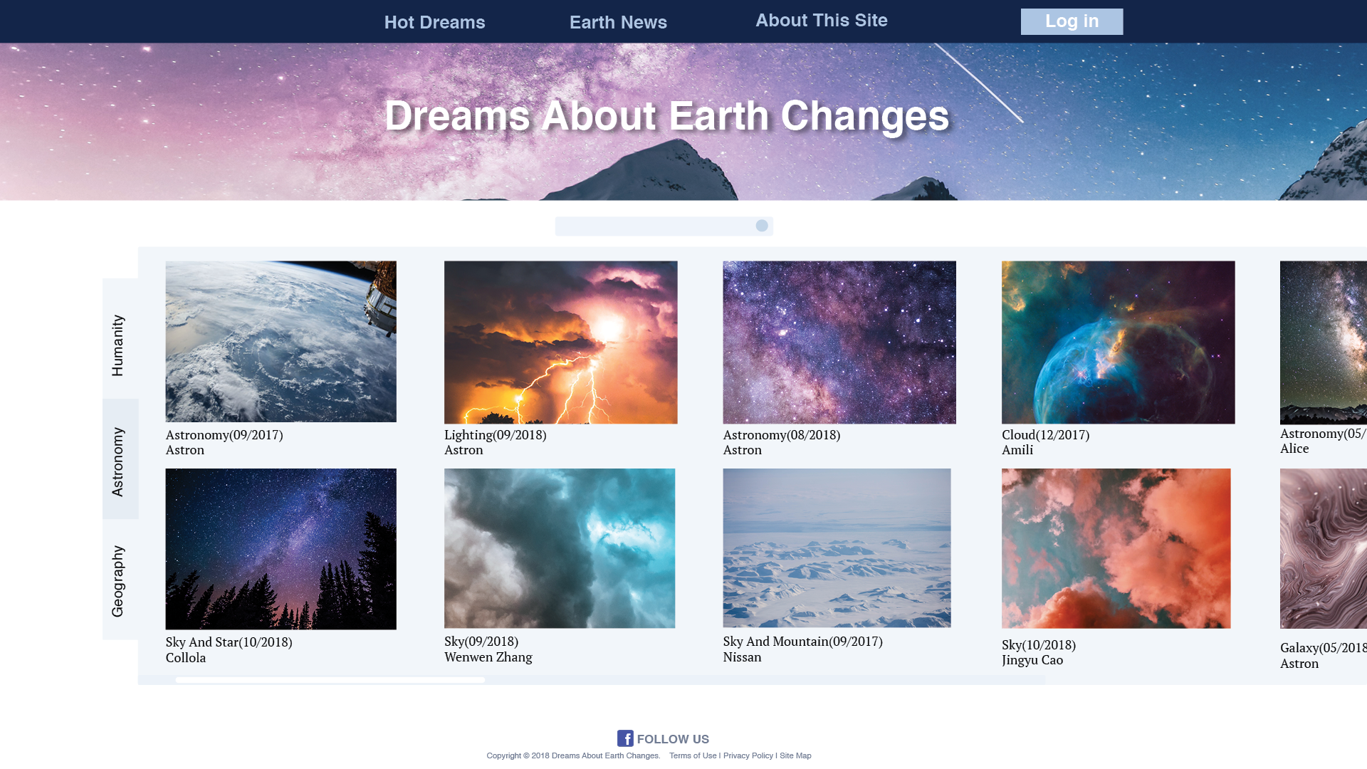
COLOR: This website has a horrible color. It contains purple and yellow in a large area, which creates too much contrast. Besides, it has different kind s of blue, such as sky blue, light blue, dark blue. Unfortunately, they do not match each other, but make contracts to each other. Considering those colors, I could make a comment that this website has too much color, which make people feel dizzy.
EFFECTIVE NAVIGATION: When I read the page of this website, it is so difficult to find information. The main menu is too small and too dark. News are placed in random. People are hard to know which news is new and important or recommended. Besides, titles of news are different. Sometimes there are a lot of words to describe a new. However, some news does not have a title.
VISUAL ORGANIZATION: First menu and news are not organized in different groups. All news are not together. And titles are in different place. Because of this, people doubt about whether things are news or titles. Besides, the news is of different size and color. It is not good for people to read.
TYPOGRAPHY: All fonts are ugly and difficult to read for the users. Words are not placed and organized well. They separate in a different place or they all are in middle. The colors are strange. Sometimes it is too dark for reading, sometimes it is too light for reading.
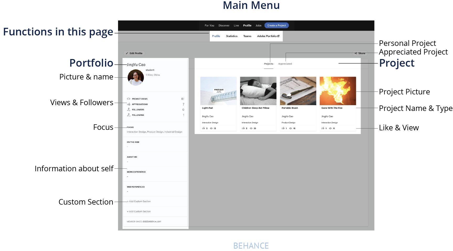
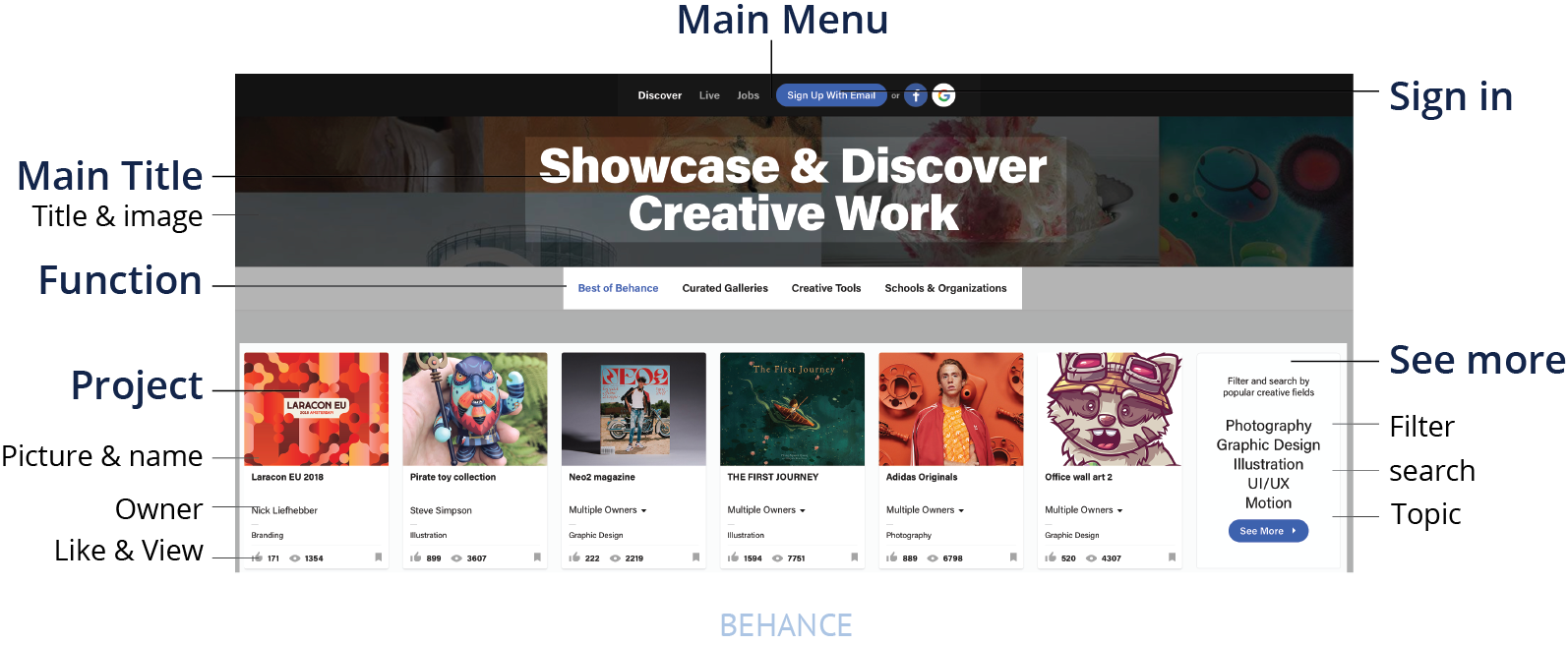
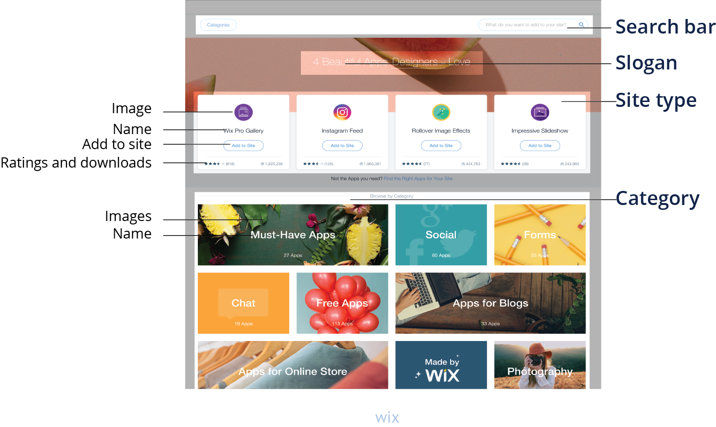
03 COMPETITIVE ANALYSIS
Behance and Wix have similar function with the great dream. I compared them with the great dream and analyzed them.
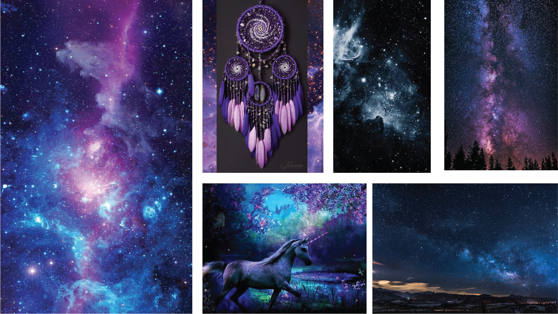
04 MOODBOARD
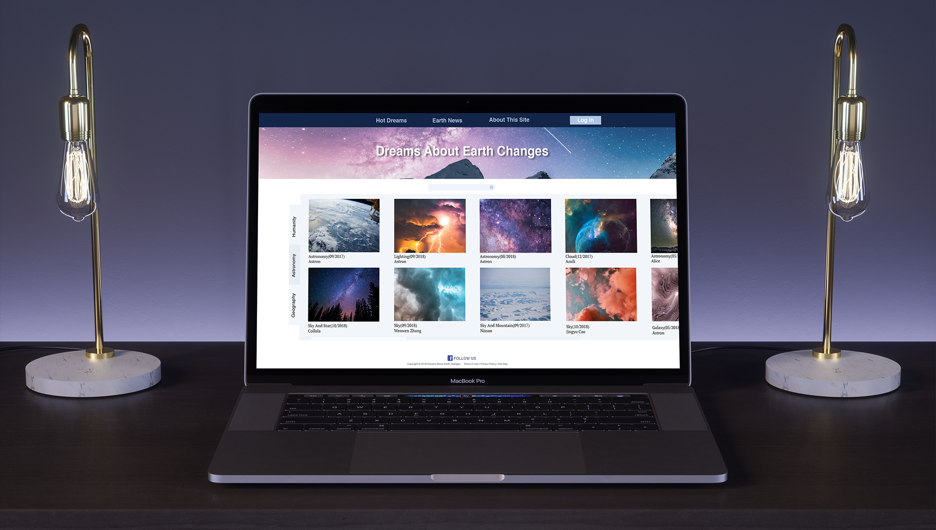
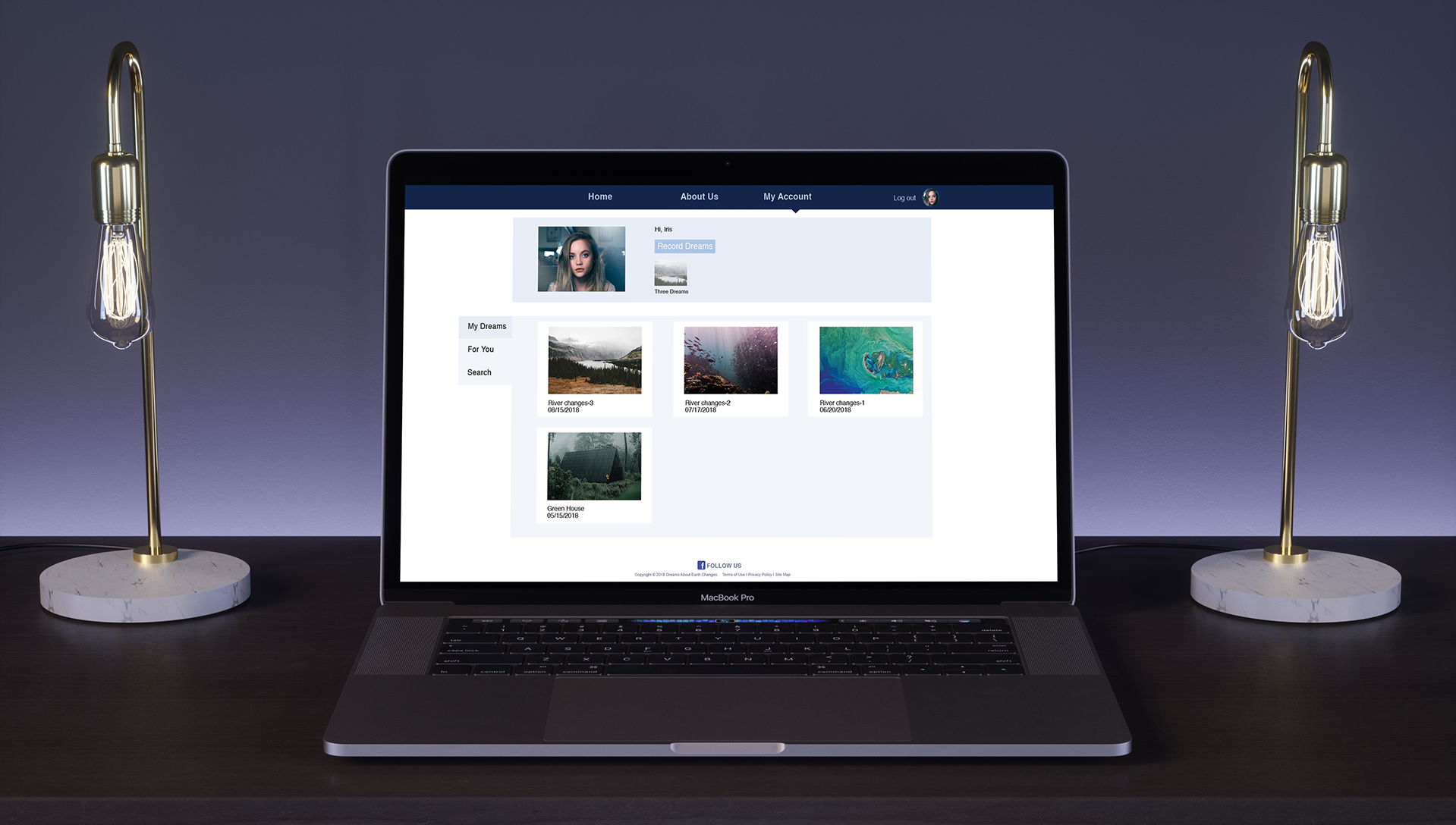
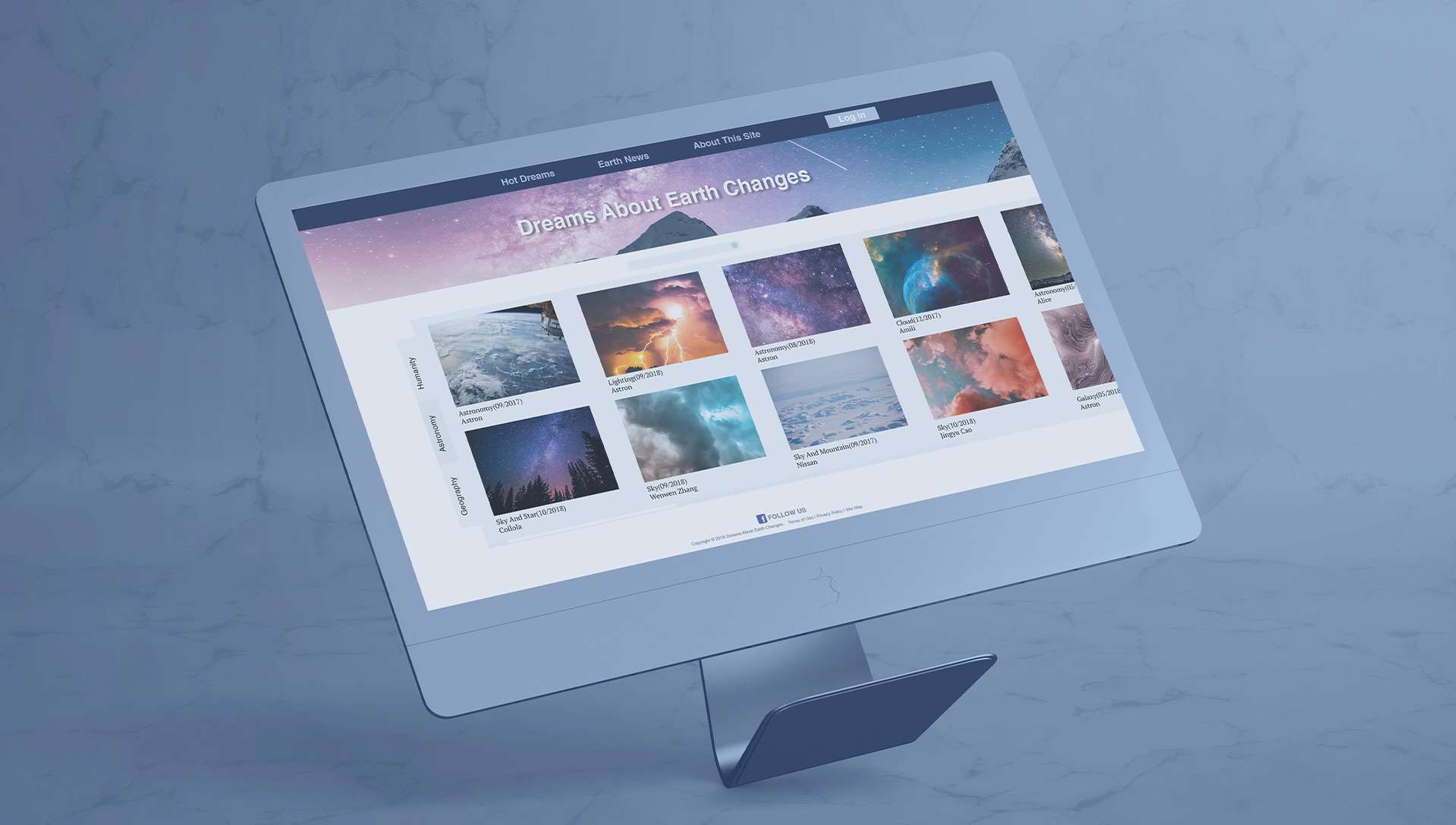
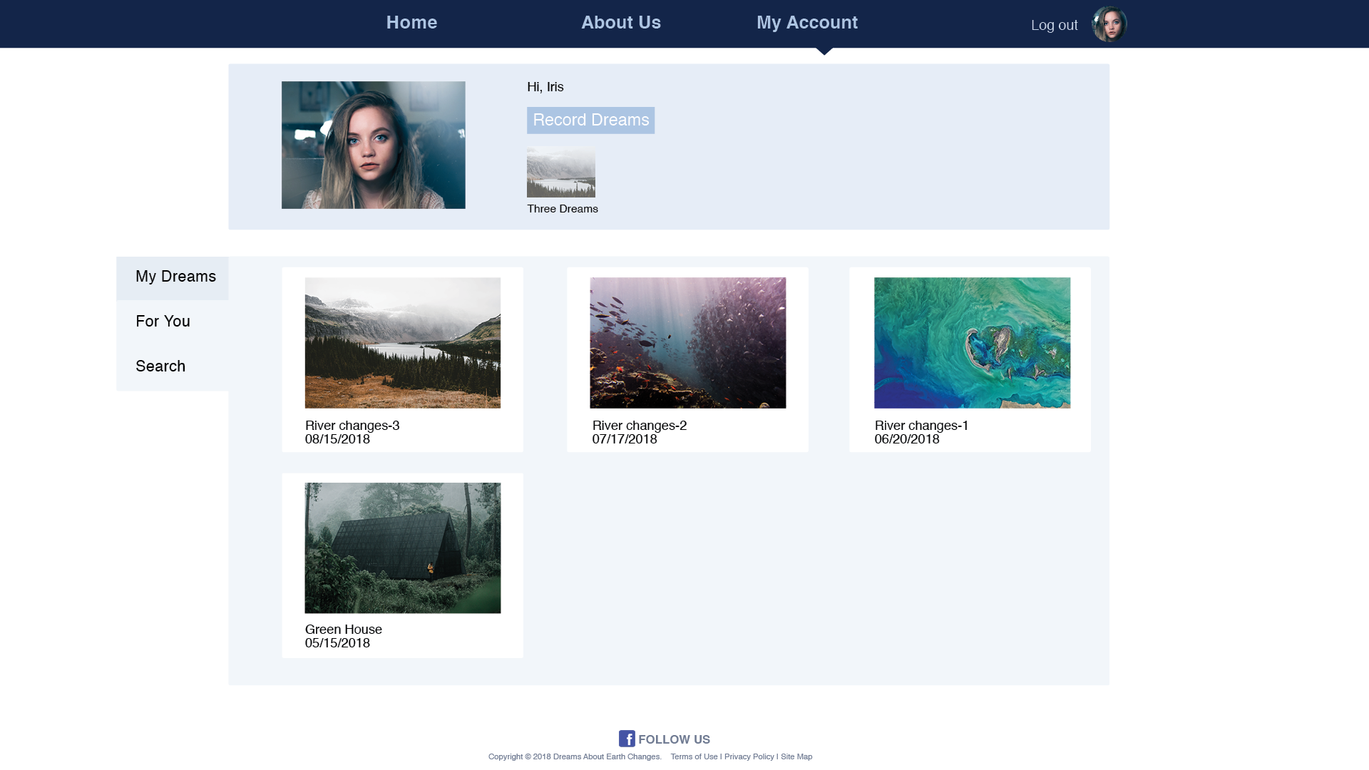
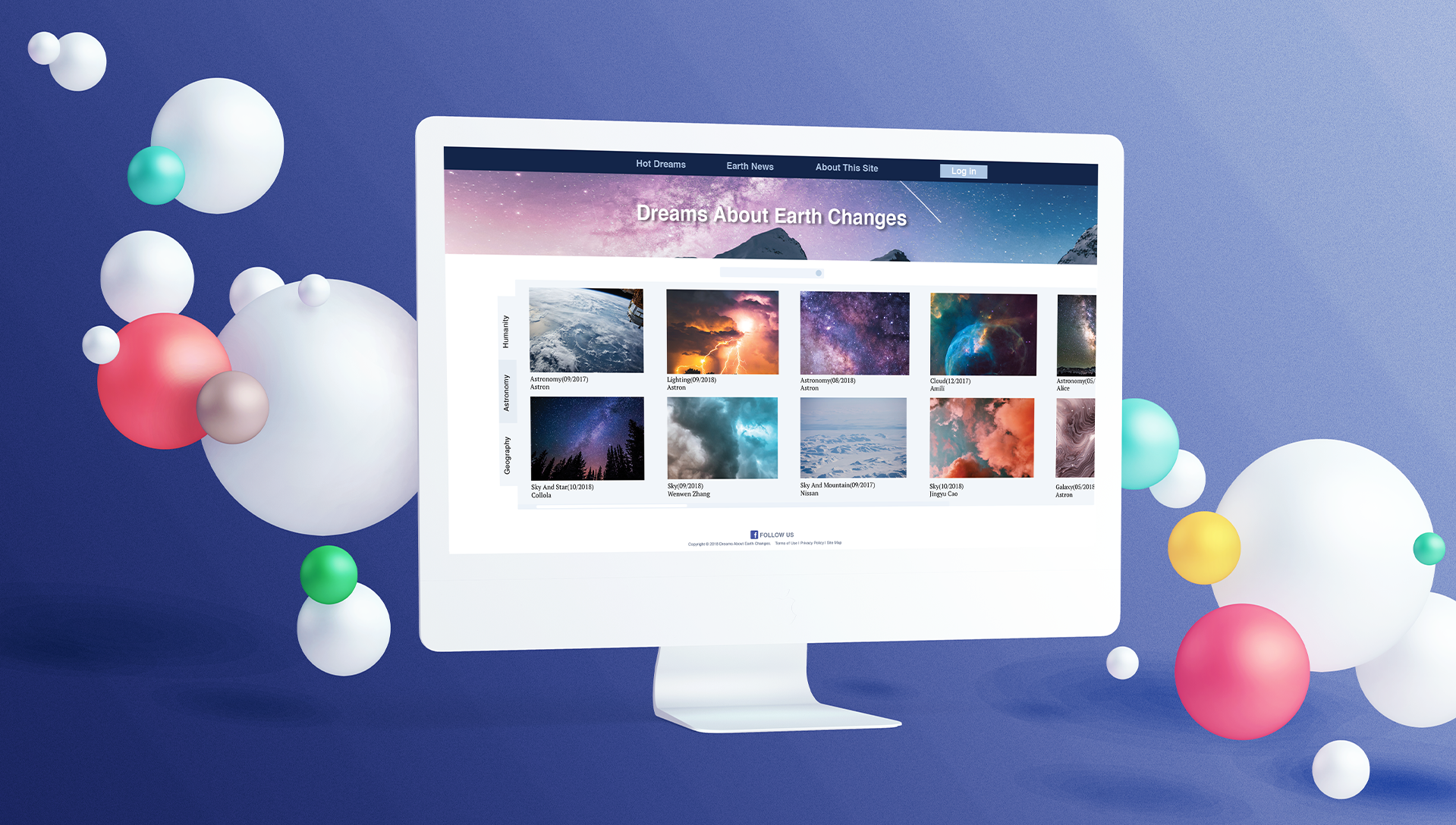
05 FINAL
Other Works
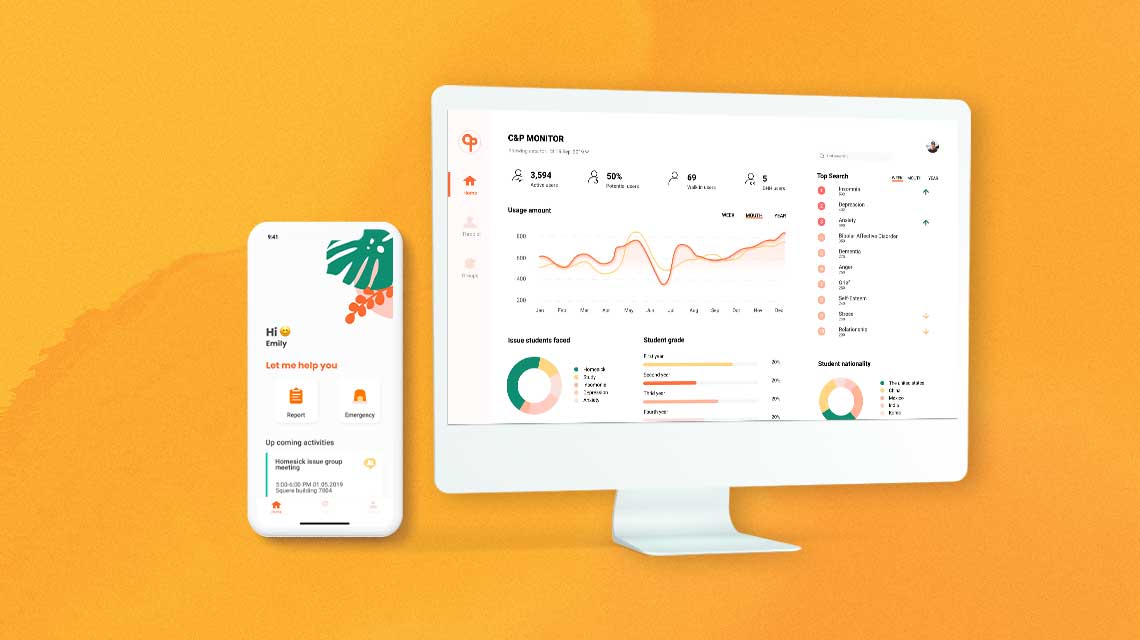
C&PUX/UI
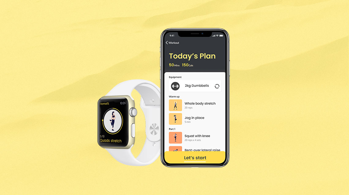
HomefitUX design/UI design
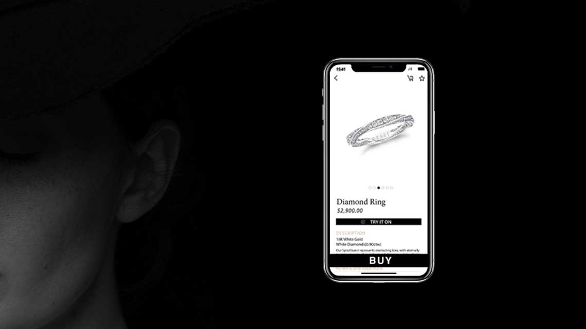
Jewel BoxUX design, UI design

YONYOUInternship
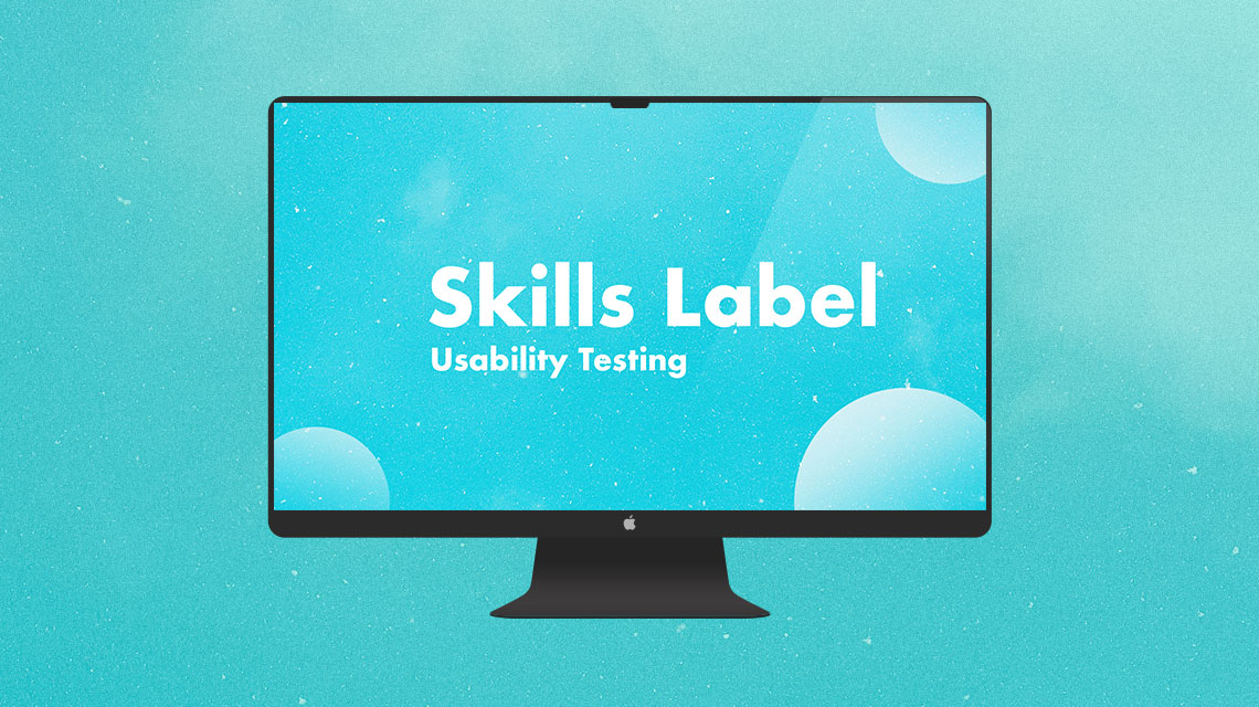
Usability Evaluation - SkillsLabelUsability Evaluation
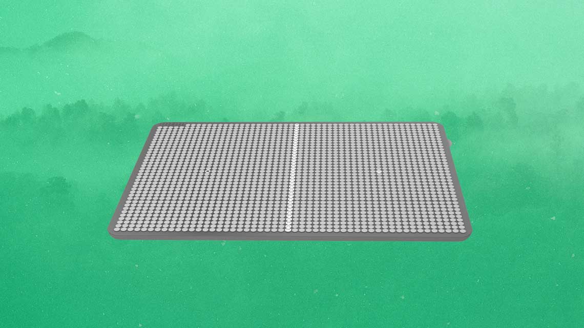
Light-PadUX design, Service design for blind people, Product design
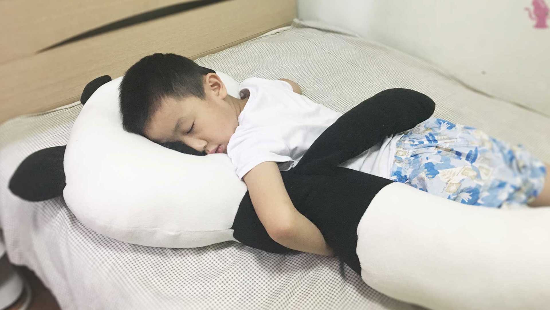
Children Sleep Aid PillowUX design, Product design
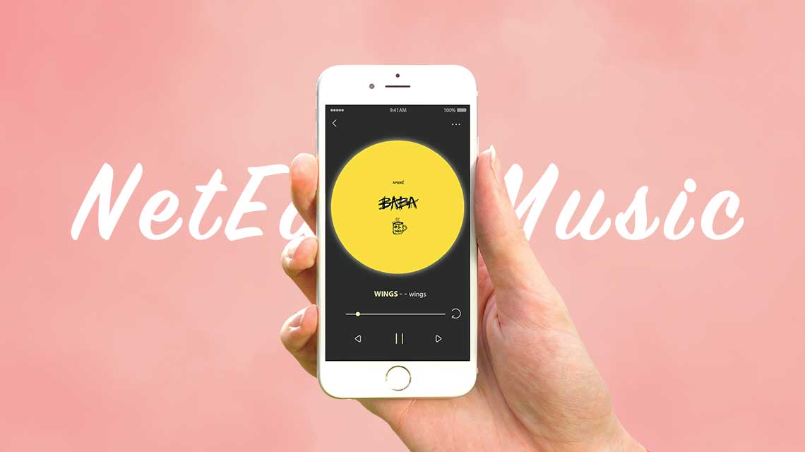
NetEast MusicUX desgin, UI design
Web RedesignUI/UX
Portable BrushProduct design

Gone With The Fireinteractive installation design
Eve3D-Modeling
Future UI3D-Modeling