TYPE
course project cooperated with RIT Counseling and Psychological Services
DURATION
9/2019-10/20189
BRIEF INTRODUCTION
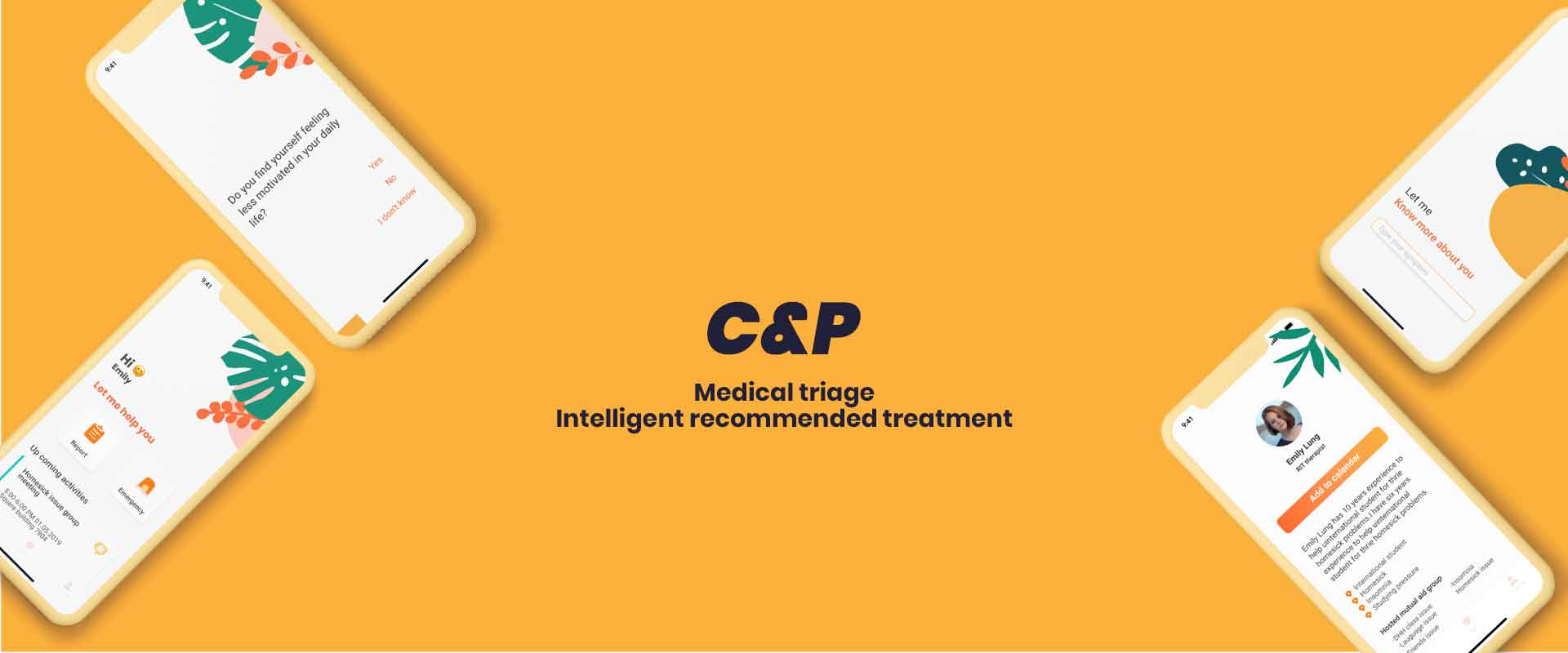
C&P is an app to help RIT Counseling and Psychological Services optimize the use of limited therapists and reduce the burden on consultants. In order to ease the work of the therapist and meet the demand of students, C&P has an interactive system that collects the user's symptoms and gives recommendations on how to proceed. The dashboard in C&P displays the real-time demand data to manage the services and personnel based on demand.
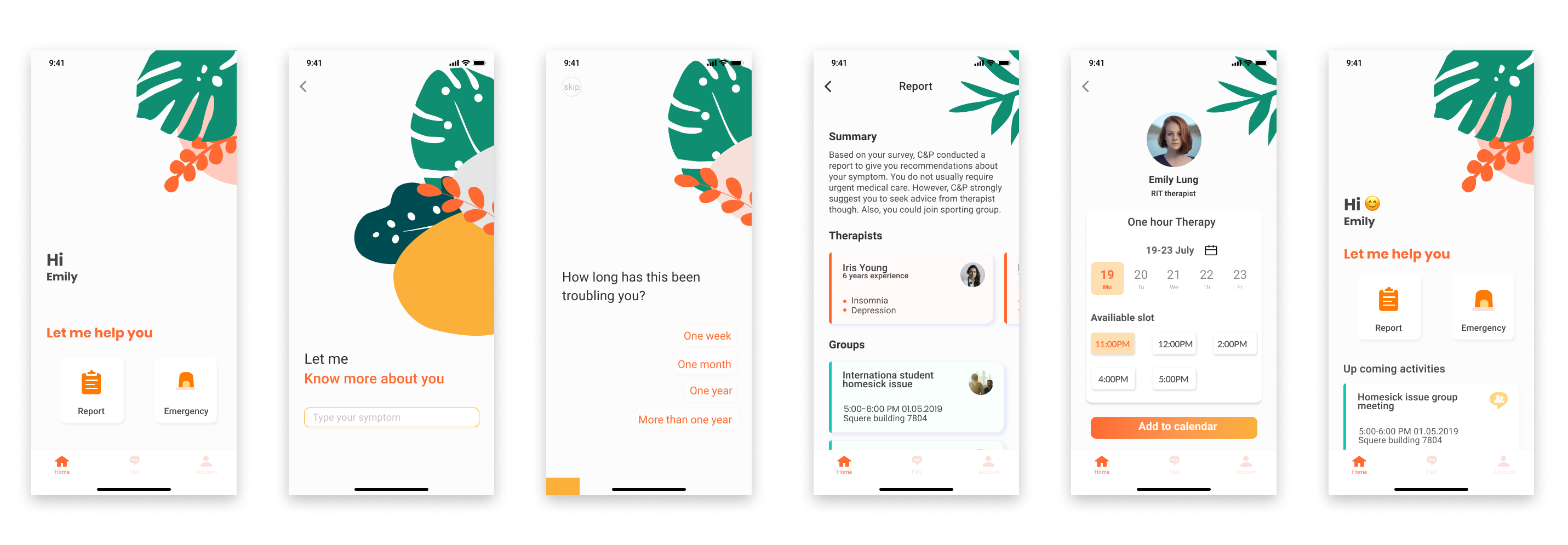
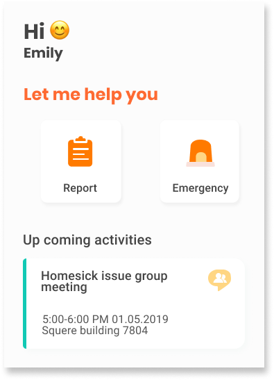
Pre-Visit interactive form for initial recommendations
C&P provides surveys to determine the user's symptoms and collects related information. All questions in the survey are used to understand the user's symptoms in order to give rationalized advise before the visit. The report includes recommendations about treatment options and services that RIT Counseling and Psychological Services provide which are suitable for the user.
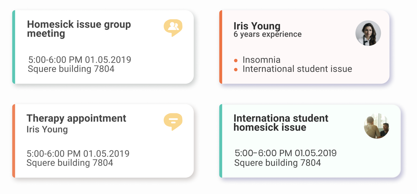
Generate reports to help choose therapist
C&P generates a report based on the Pre-Visit interactive form, explain the current situation for the user, and give recommendations. The recommendation clearly describes the therapist and support group suitable for the user, so that the user can easily select and make an appointment. Online booking also makes booking more convenient, users could check whether there their therapists have new time slot.
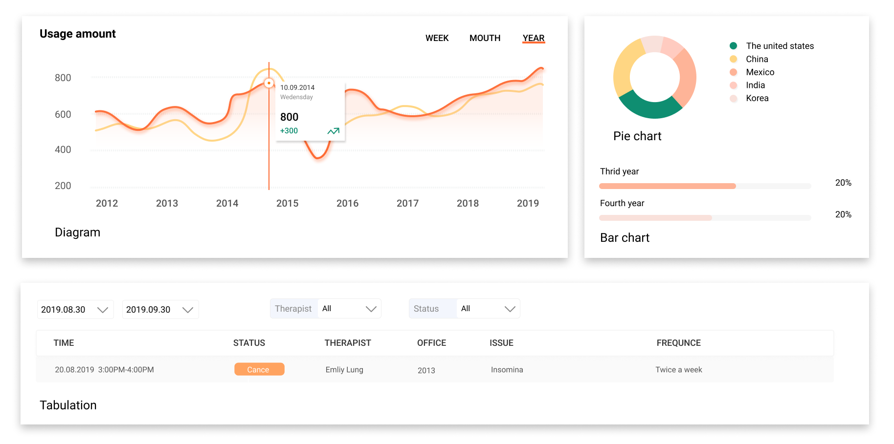
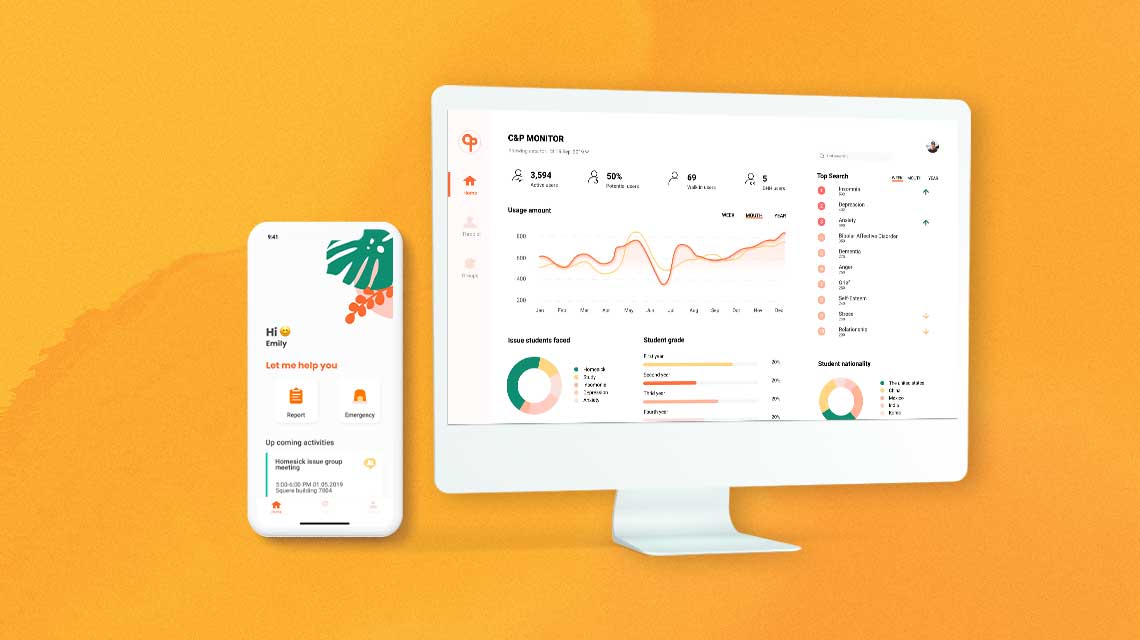
Analyze demand using data
The dashboard shows data for traffic and demand. Employees can manage daily or semester service volume through traffic information. Employees can also analyze the data from the dashboard to match the needs of students.
· 01 PROBLEMS ·
RIT has Counseling and Psychological Services. However, limited therapists can't provide the needs of a large number of students. How to understand the needs of students so as to maximize the use of manpower and resources to help students has become the biggest problem facing us.
· 02 APPROACH ·
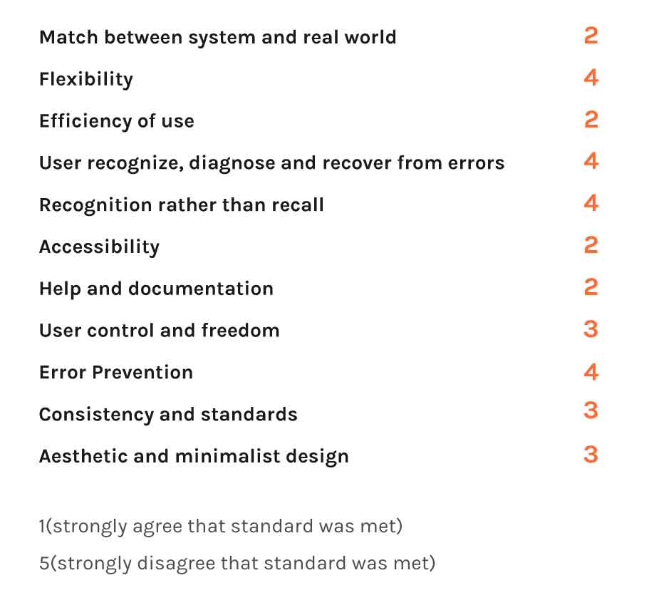
Evaluation
Based on the 11 evaluation roles, I did an evaluation for the RIT counseling and psychological services website to know the feeling and experience of using it.
- The service can not meet the amount of students' needs.
- There is limited information about services on the website.
- There is no way to make an appointment.
Interview
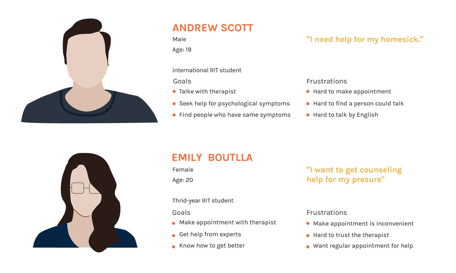
I interviewed six students including students need help, tried to find help and have gone to therapy. Also, I interviewed offical staff in RIT Counseling and Psychological Services center.
Students are hard to know what should they do and what kind of services is suitable for them.
There is no system to analyze students' needs in the services center.
DHH students and international students have challenges in communication.
Competitive research
Headspace and Ada which are apps about illness and therapist. I used them and conduceted my anlyze about where they do well and bad.

Persona
· 03 SOLUTION ·
Solution
I design an app and back system for this project. The app is for students to take survey and get recommendation about how could do for the next step. The monitor is for staff in the service center to analyze the data and come up with a solution.
APP
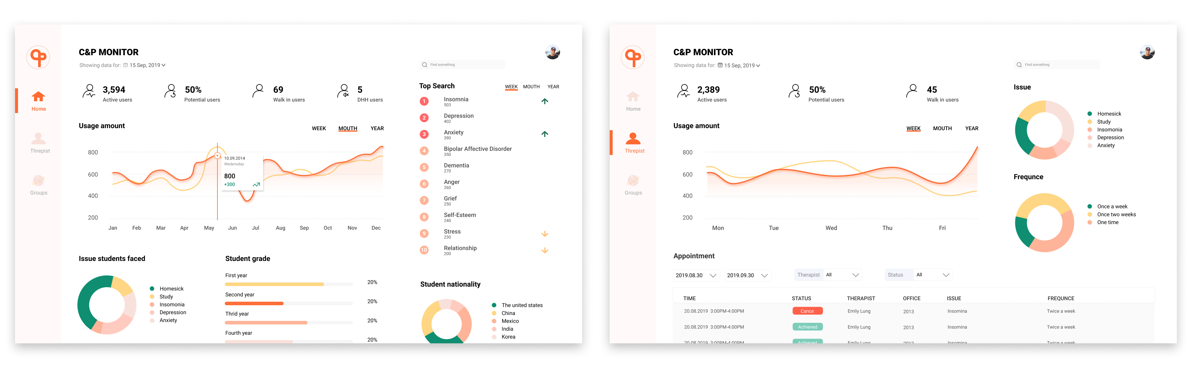
The monitor
· 04 DESIGN ·
# How to make survey interactive and easy to use?
Through continuous iteration, I finally chose the right-most version-the the right selection area. The selection area on the right meets the habits of right-handers. It is very convenient to jump to the next question automatically after selection. The progress bar gives the user a reminder of the degree of completion. A large number of blank areas can use visual design to attract users to enhance the fun.
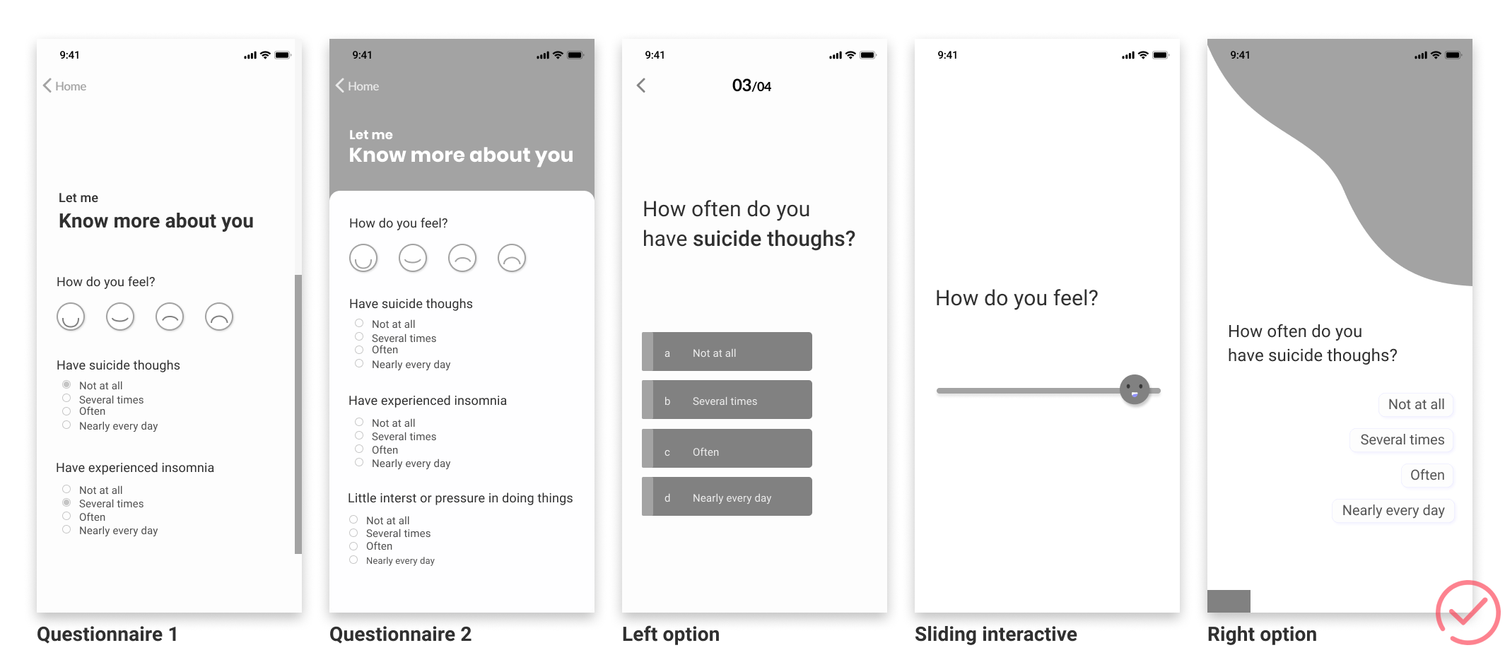
The right option is the best. It is easy for people to click by the right hand. Most people are used to the click button by right hands.
# How to create efficient and refreshing monitor?
For the computer-side interface for data visualization, the most important thing is to use the interface distribution to allow users to quickly find the information they need. On the interface, through the golden section, determine the best points of interest and secondary points of interest. Distribute key information in the best location, making the interface efficient. In information, the priority of information is divided by the importance of information.
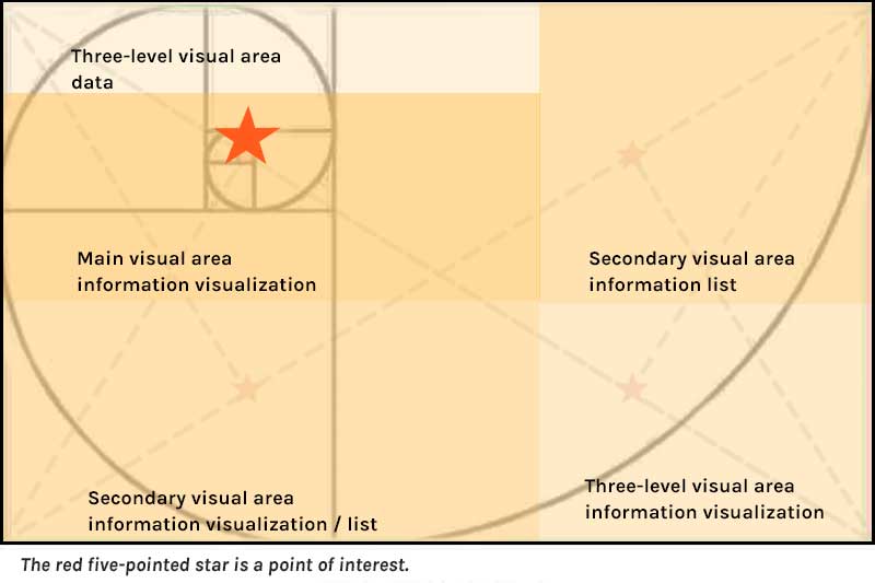
Diagram:
Can well show the changing trend along a certain dimension
Can compare the trend of multiple sets of data in the same dimension
Suitable for displaying large data sets
Pie chart:
Simple and intuitive, it is easy to see the proportion of components
Bar chart:
Simple and intuitive, it is easy to see the value based on the length of the column
Easy to compare the differences between the various sets of data
Tabulation:
Many data, clear data, easy to find
# How to create simply and clean information card?
Style one can only distinguish consultations and activities from the pictures on the left, which is difficult to distinguish quickly. The shape of Style 2 is too narrow and visually crowded. The three major areas of style are not consistent with the overall style. The style four is clear and concise, and the consultation and activities can be distinguished by the color on the right.
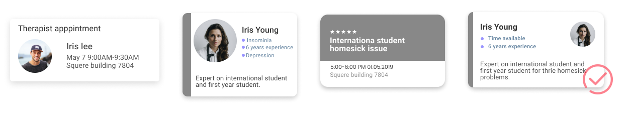
style 1
style 2
style 3
style 4
# How to create cute and approachable illustrations?
Style 1 uses the design of a round smiley face. The smiley face can be closer to the user. The round shape is a soft shape with no corners and no attack. However, the color is effectively dim, and purple as a neutral color has an elegant and calm mysterious feeling, but it will be slightly noble and produce a sense of distance. Style 2 uses plants as the theme, which makes people feel sunlight, freshness and air. Can green make people feel happy and fresh. Orange as a warm color makes people feel warm.
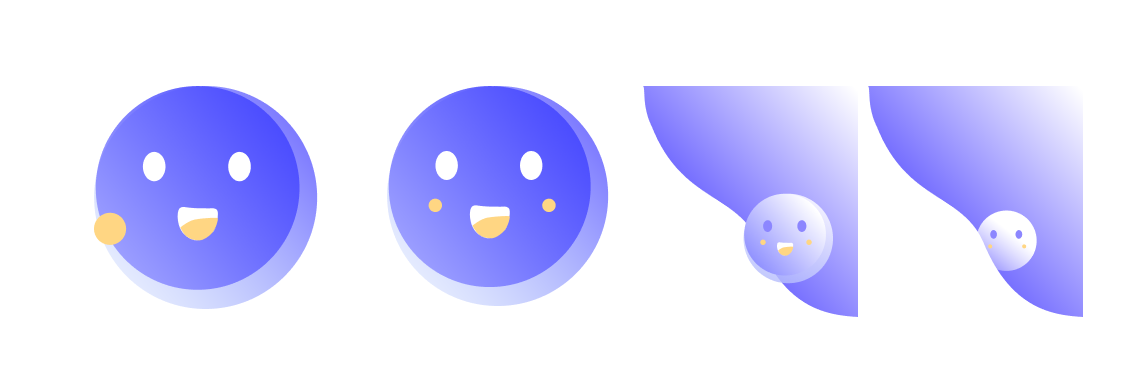
Style one
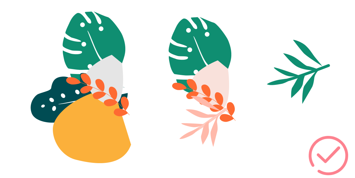
Style two
# How about usability testing?
This was think-aloud testing in which I tested this Hifi styles. I conducted the tests with only one task. This was followed up by a short interview afterward to understand users' pain points and what they wanted to see.
"It would be great if there is up-coming events in the home pages to remind users."
"I hope all event seems not to be individual with no connection."
I invite the staff of RIT Counseling and Psychological Services center to participate in the user test. They have a high opinion of c & P and hope to develop a project. Unfortunately, due to time constraints, I can't complete the development independently.
· 05 NEXT STEP ·
- Track the symptom for students. Students could know how they face the symptom, which would give students motivation.
- Send students survey answers to the therapist to help the therapist know the situation about the student early.
- A website vision for the system in order to help students fill information in the walk-in time.
- Provide self-resource for students to read and get help.
Other Works
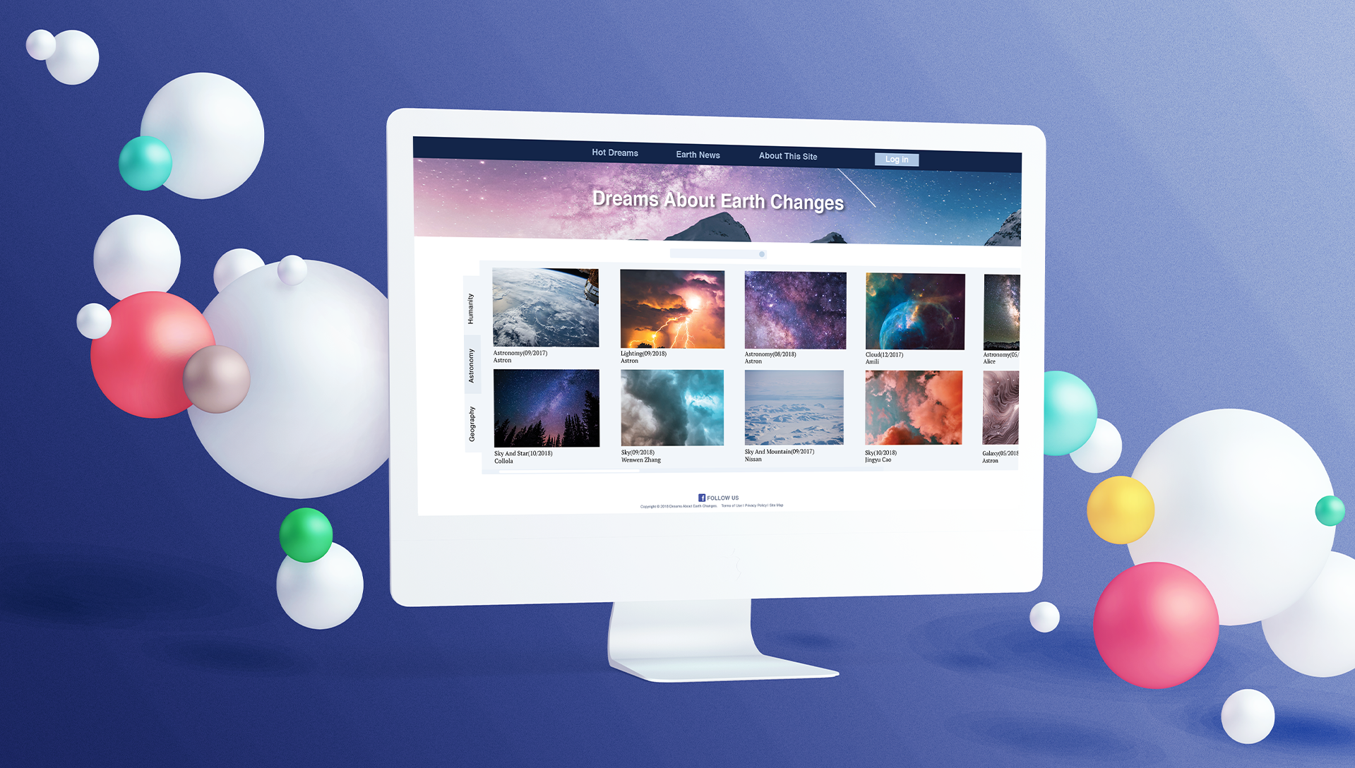
C&PUX/UI
HomefitUX design/UI design
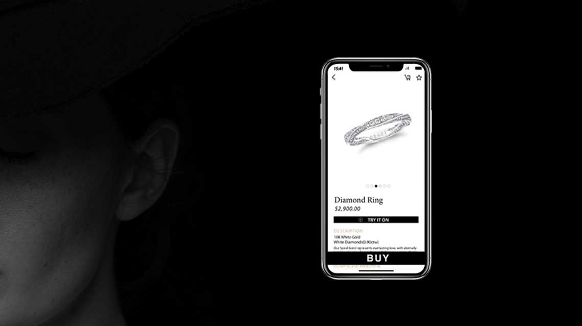
Jewel BoxUX design, UI design

YONYOUInternship
Usability Evaluation - SkillsLabelUsability Evaluation

Light-PadUX design, Service design for blind people, Product design
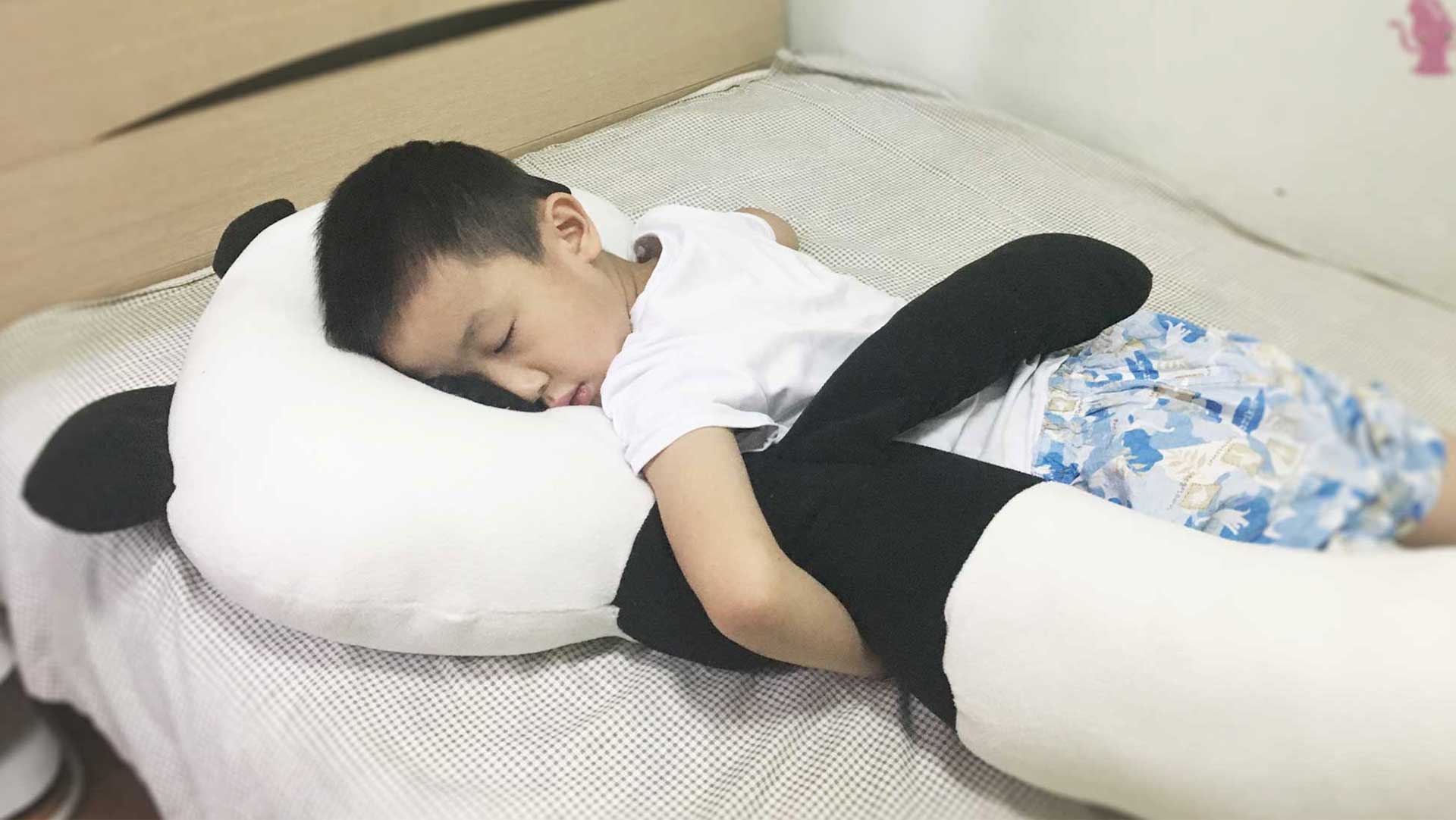
Children Sleep Aid PillowUX design, Product design
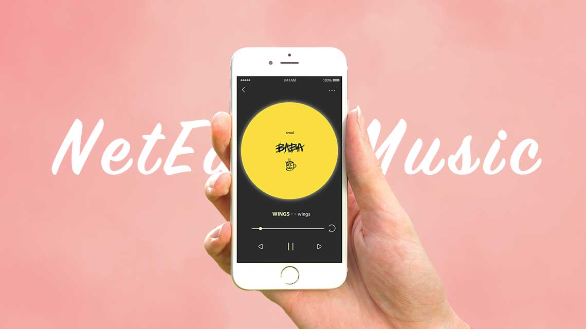
NetEast MusicUX desgin, UI design
Web RedesignUI/UX

Portable BrushProduct design

Gone With The Fireinteractive installation design
Eve3D-Modeling
Future UI3D-Modeling