
TYPE
Visual Exploration
DURATION
9/2018-10/2018
BRIEF INTRODUCTION
Based on the current music play-NetEase, I explored three different styles. I redesigned the home page and player page, inspired from styles.
· 01 PROBLEM ·
I chose two main pages to analysis. The first one is the home page, which includes recommendations and the home menu. The second one is the listening page.

· 02 ANALYSIS ·
The NetEaseMusic is a music player app. It currently does not look good and is not easy to use. The background image is too dark. For users, it has too many functions, which is confusing.

· 03 STYLE EXPLORATION ·
SUMMER NIGHT
I love light music, soft music. When I open music player, I remember walking with my friend, listening to soft songs at night this summer.

COMFORT ZONE
People like to listen music to feel comfort. It seems like music creat a comfort zone for us.

ENJOY LIFE
Music becomes a way to enjoy life. People could do anything when they listen music.


Other Works
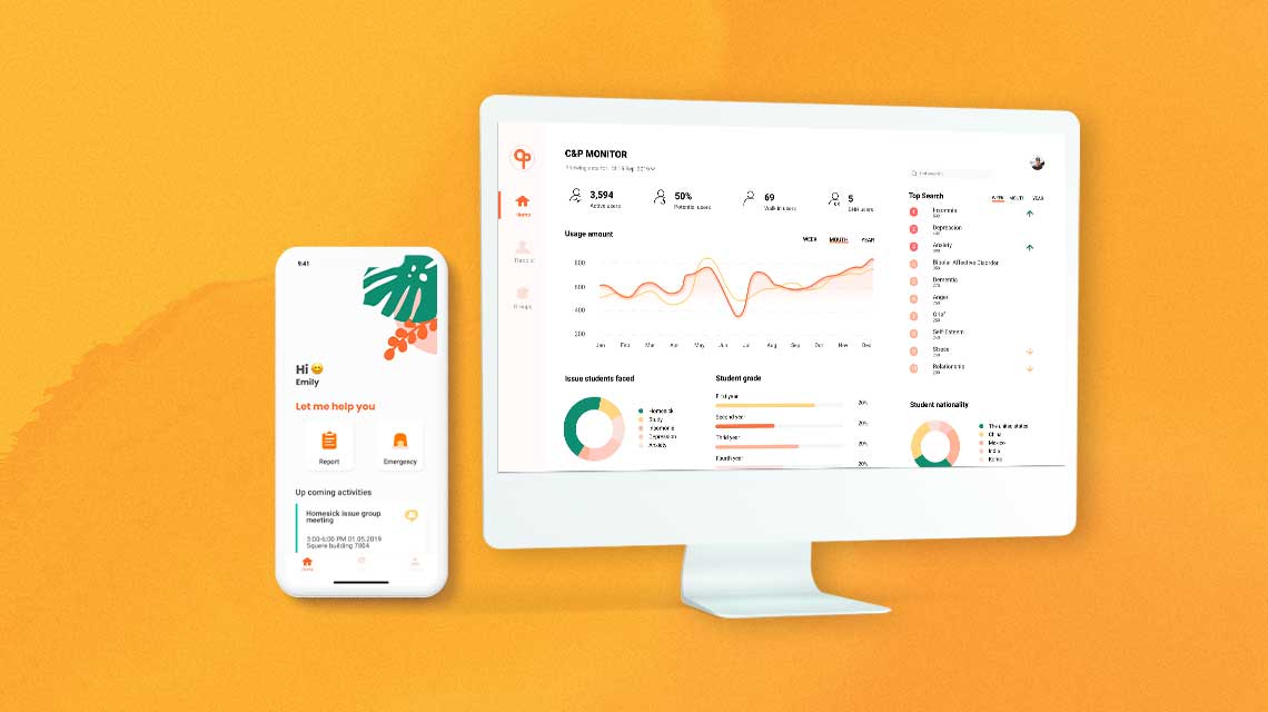
C&PUX/UI
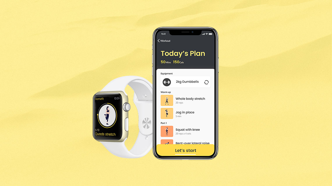
HomefitUX design/UI design
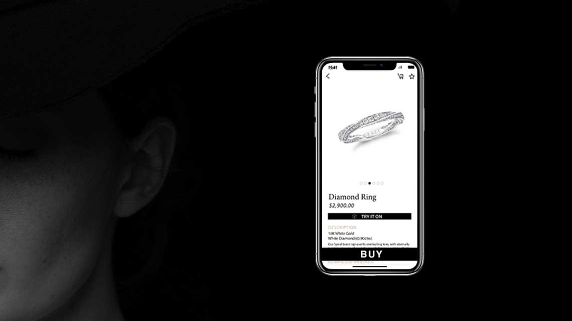
Jewel BoxUX design, UI design

YONYOUInternship

Usability Evaluation - SkillsLabelUsability Evaluation

Light-PadUX design, Service design for blind people, Product design
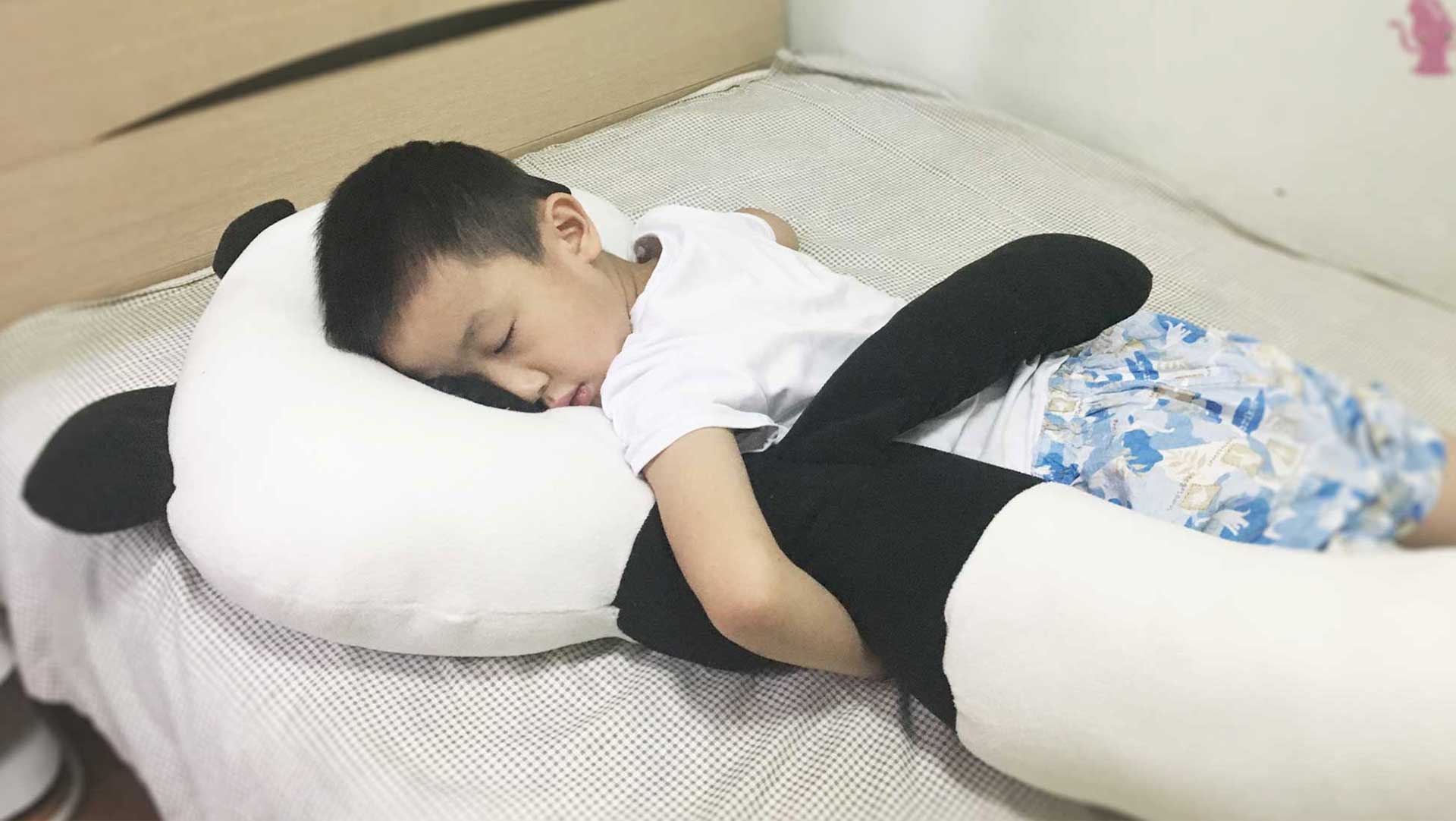
Children Sleep Aid PillowUX design, Product design
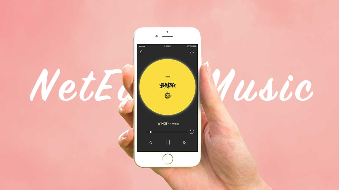
NetEast MusicUX desgin, UI design
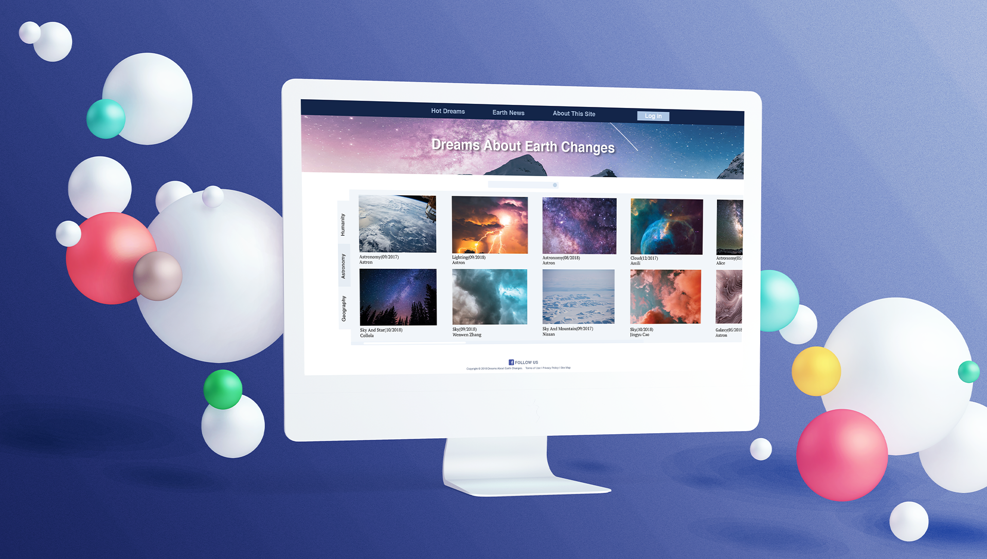
Web RedesignUI/UX

Portable BrushProduct design

Gone With The Fireinteractive installation design
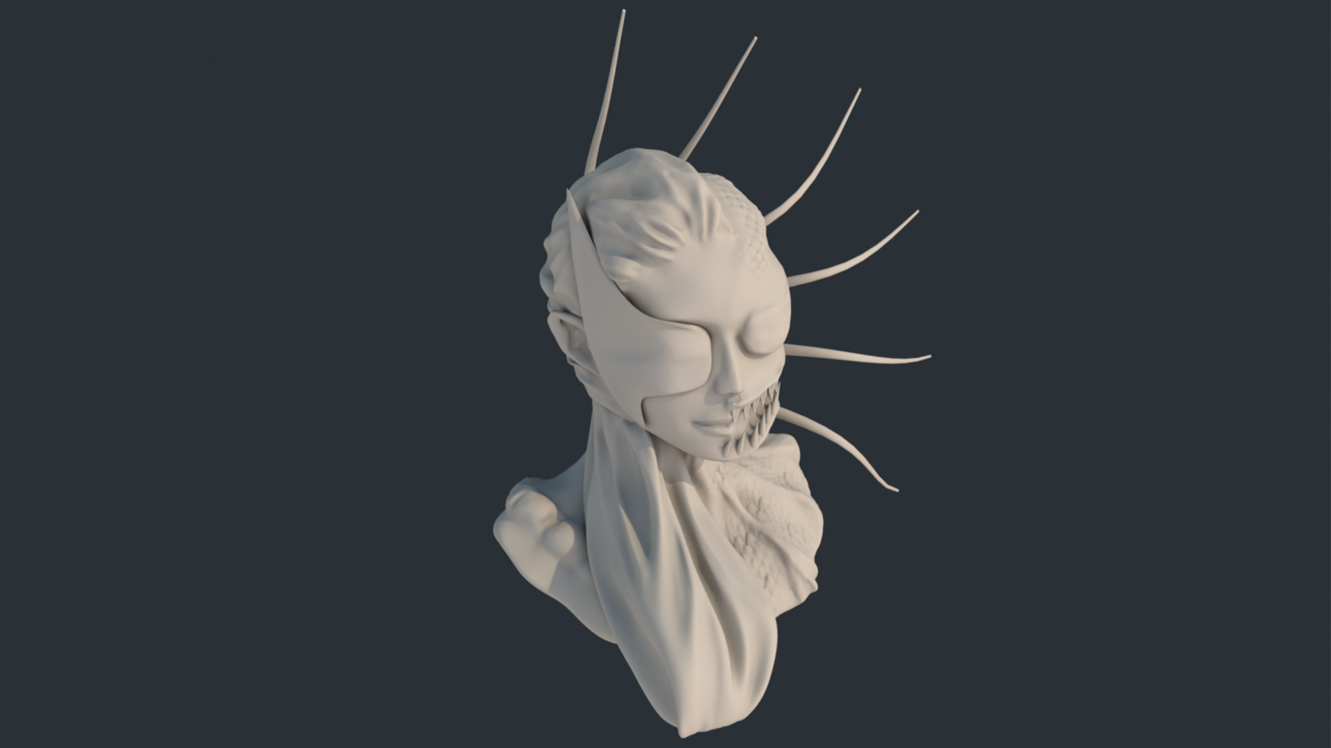
Eve3D-Modeling

Future UI3D-Modeling
